1人分から買えるオフィス防災備蓄|増員時の補充・期限管理もCLASにおまかせ
2026/05/14
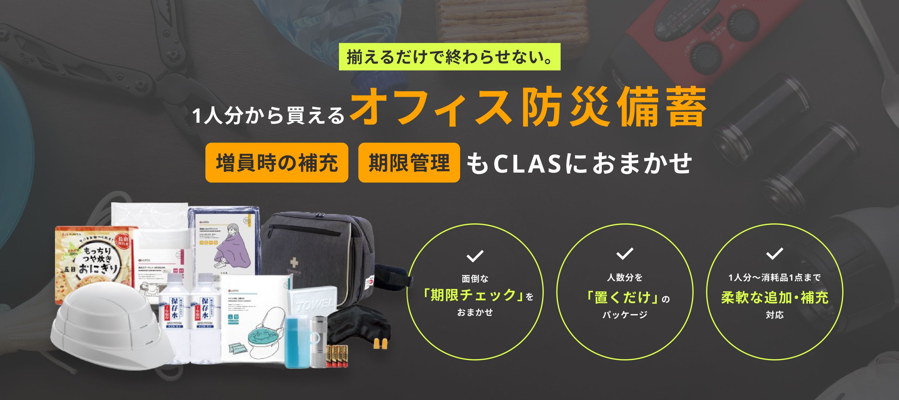
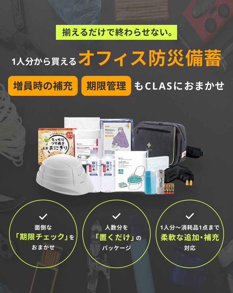
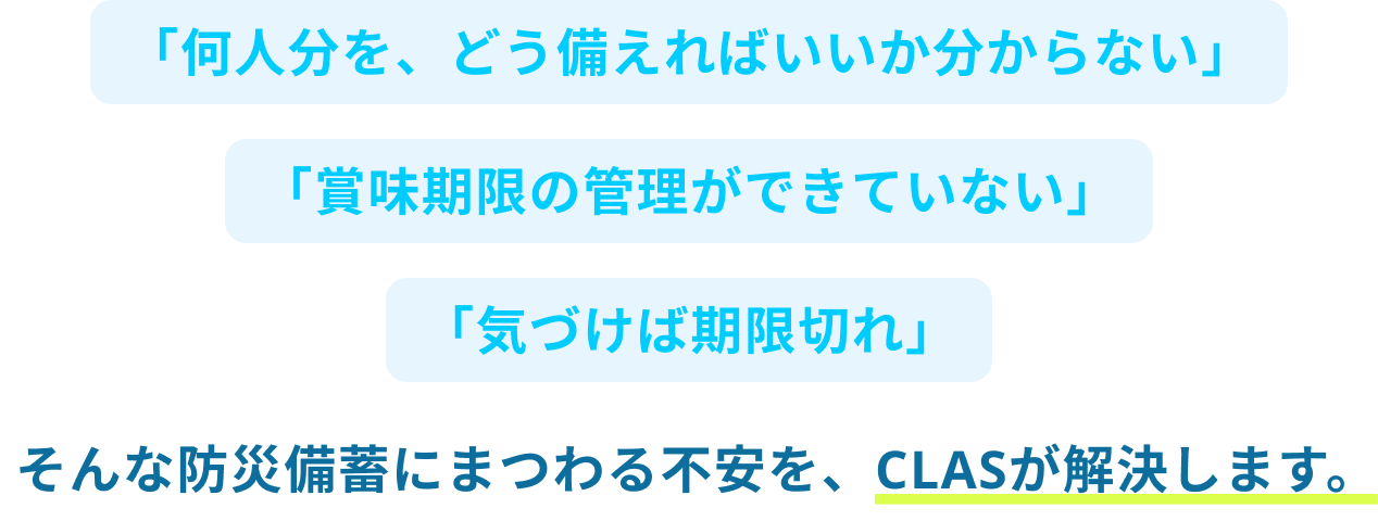
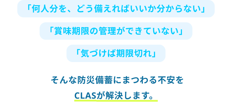
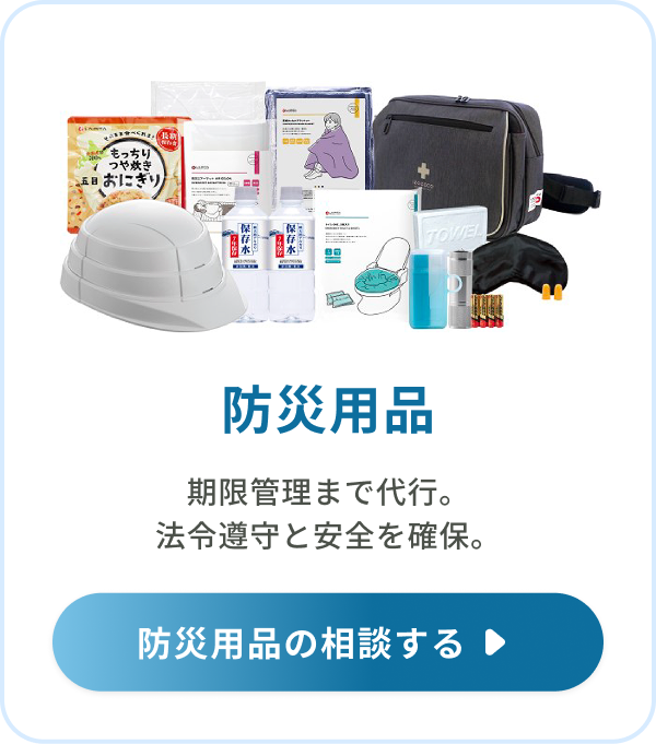
御社は「従業員が何名いるか」を伝えるだけ。 プロが厳選したセットを導入し、期限管理までお任せいただくことで、法令遵守と社員の安全を確実に守ります。

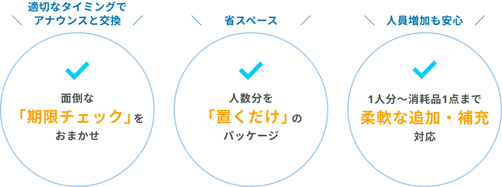
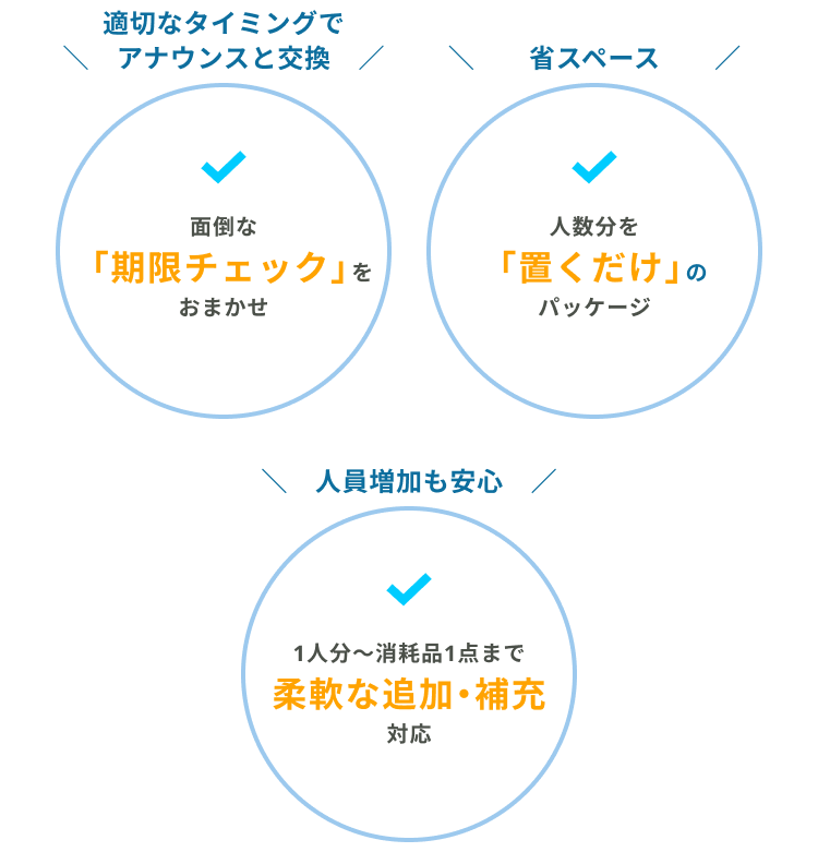
CLASが選ばれる3つの強み
厳選された防災ソリューション
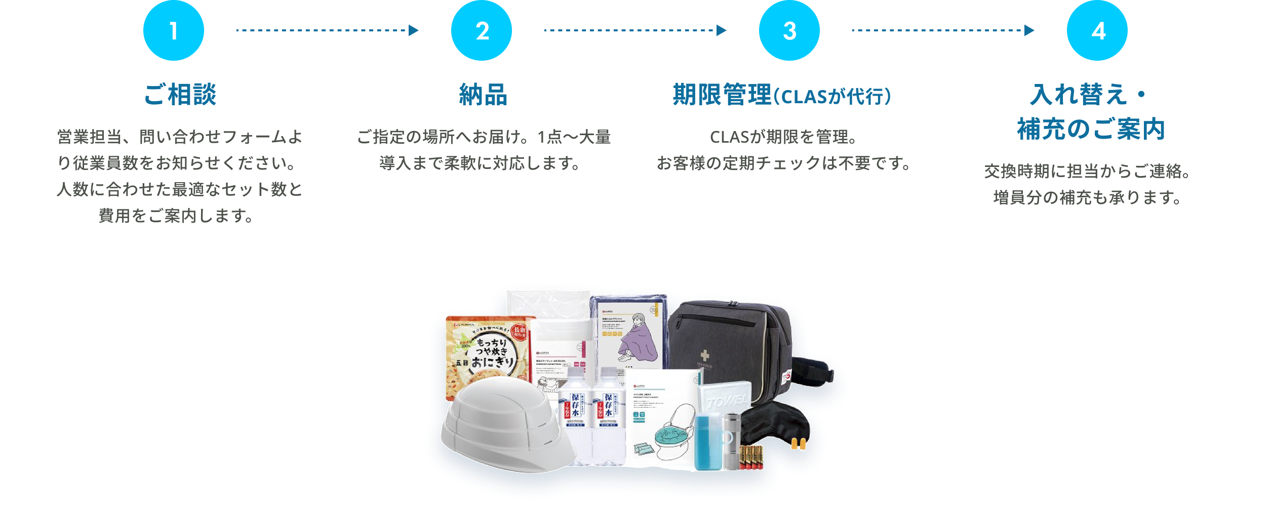
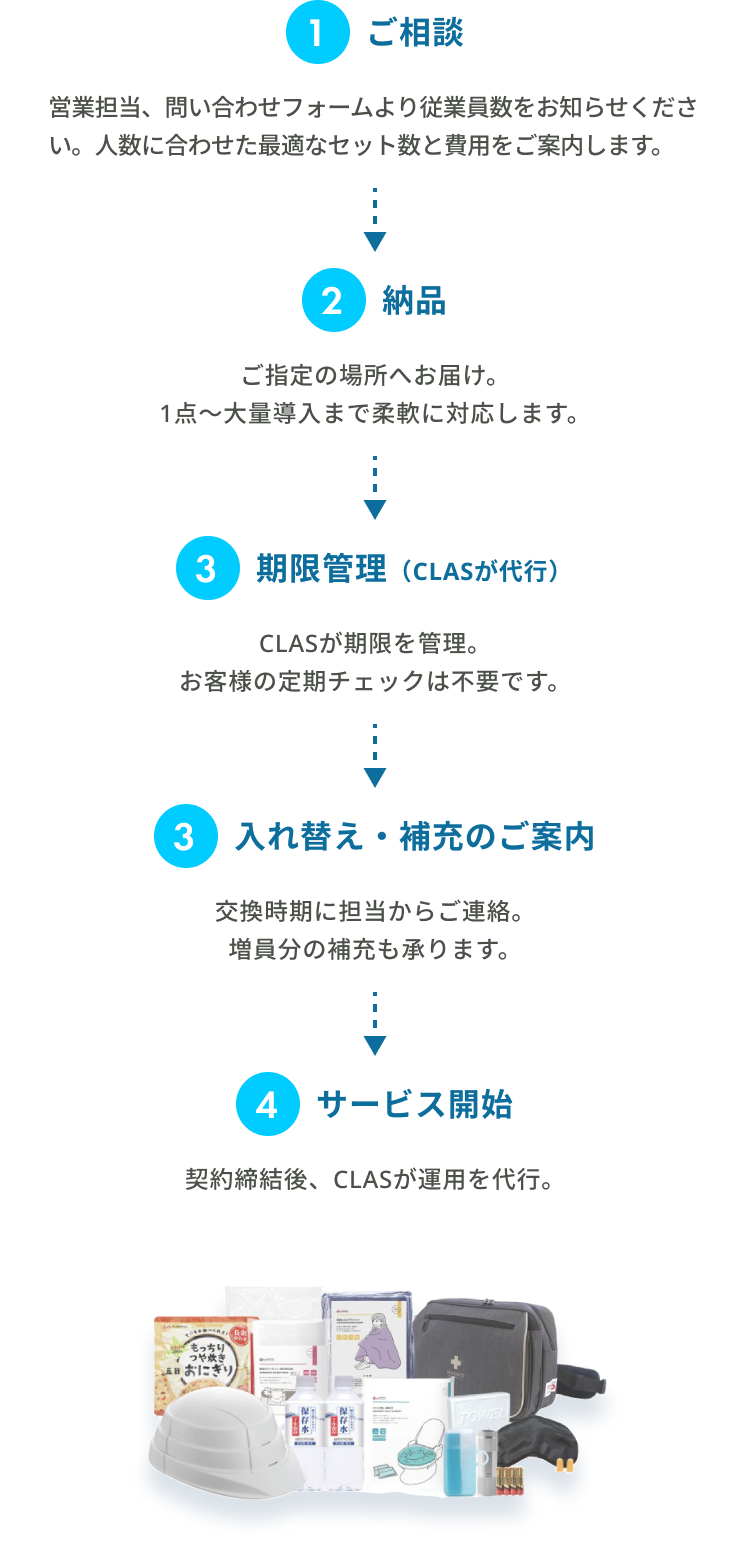
導入までのフロー
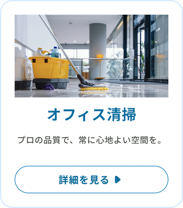
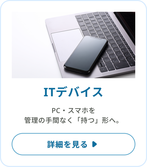
もっと「身軽なオフィス」へ。その他のソリューション
PC、デスク、会議室、そして防災。バラバラだった窓口をCLASひとつに集約。発注の手間を最小限にし、企業の成長スピードを加速させます。