{{ toastMessage }}
家具と家電のレンタル ・サブスク CLAS (クラス)
メニュー

家具と家電の

レンタル・サブスク

カート {{ cartQuantity }}
{{ categoriesBarTitle }}

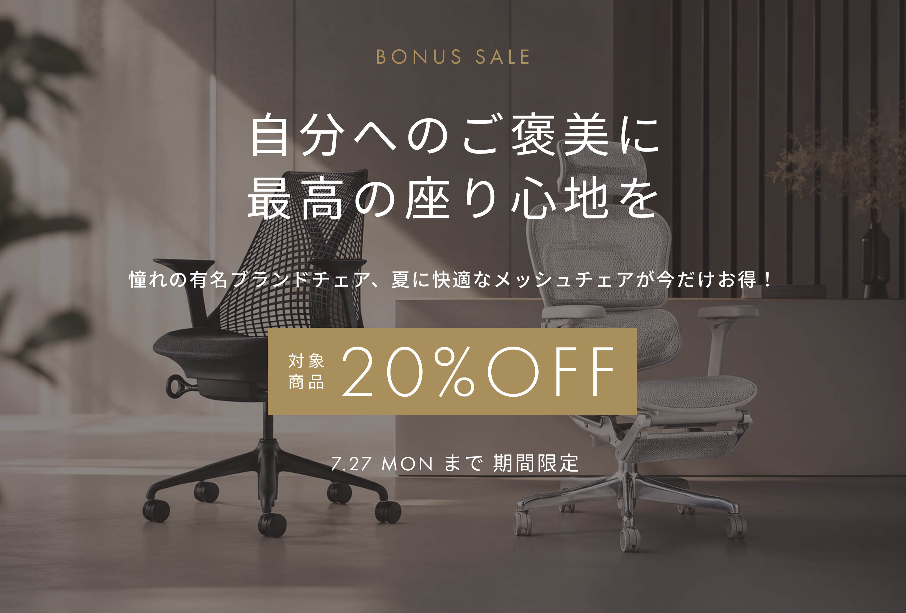
オフィスチェアボーナスSALE

2026/07/08

/* ================================================================ CLAS × オフィスチェア SALE「夏のデスクが、変わる」— 記事ページ LP CSS ▼ 管理画面「商品一覧のCSS」欄に貼り付けてください ※ 差し色チェア CSS / ソファ CSS / ベッドSALE CSS が入っている場合は【末尾に追記】してください(置換不可) prefix: .chr- Last build: 2026-07-10 カラーテーマ: ウォームエスプレッソ × ウォームクリーム × シャンパンゴールド キャンペーン期間: 2026年7月8日(水)20:00〜7月27日(月)23:59 ================================================================ */ /* ---------------------------------------------------------------- CLAS 既存ページ側 要素の強制非表示(他ページと同様) ---------------------------------------------------------------- */ [class*="ProductIntroduction__section"] picture { display: none !important; } [class*="ProductIntroduction__title"], [class*="ProductIntroduction__button"], [class*="ProductIntroduction__description"], [class*="ProductListPage__stripeBackground"], [class*="SearchCondition"], [class*="CategoryList"], [class*="CategorySection"], [class*="CategoryBanner"], [class*="CategorySelector"], [class*="CategoryNavigation"], [class*="CategoryTree"], [class*="ViewedItem"], [class*="RecommendedItem"], [class*="ProductSortBar"] { display: none !important; } /* 記事ページ デフォルト タイトル・日付 非表示 */ .article_detail > section:first-child { display: none !important; } p.datetime { display: none !important; } /* ---------------------------------------------------------------- CSS Variables — :root で定義することで、CMSが各ブロックを 別コンテナに包んでも全セクションで変数が有効になります ---------------------------------------------------------------- */ :root { --chr-deep: #1E1B16; --chr-mid: #564E44; --chr-accent: #C4A97D; --chr-gold: #C4A97D; --chr-light: #F5F3EF; --chr-pale: #FAF8F4; --chr-border: #DDD8D0; --chr-white: #FFFFFF; --chr-text: #1A1512; --chr-sub: #4A4138; --chr-shadow: 0 2px 16px rgba(30,27,22,.10); } .chr-root { font-family: futura-pt, "Noto Sans JP", arial, sans-serif; color: var(--chr-text); background: var(--chr-pale) !important; -webkit-font-smoothing: antialiased; } .chr-root *, .chr-root *::before, .chr-root *::after { box-sizing: border-box; margin: 0; padding: 0; } .chr-root ul { list-style: none; } .chr-root a { text-decoration: none; } .chr-root img { display: block; width: 100%; } /* ---------------------------------------------------------------- Utilities ---------------------------------------------------------------- */ .chr-container { max-width: 800px; margin: 0 auto; padding: 0 40px; } @media (max-width: 540px) { .chr-container { padding: 0 20px; } } .chr-eyebrow { display: block; font-size: 10px; font-weight: 500; letter-spacing: calc(1em * 32 / 100); text-transform: uppercase; text-align: center; color: var(--chr-gold) !important; margin-bottom: 12px; } .chr-h2 { font-size: clamp(20px, 2.8vw, 28px); font-weight: 400; color: var(--chr-deep) !important; line-height: 1.85; letter-spacing: calc(1em * 12 / 100); margin-bottom: 20px; } .chr-h2--center { text-align: center !important; } .chr-lead { font-size: 13px; font-weight: 400; line-height: 2.1; letter-spacing: calc(1em * 4 / 100); color: var(--chr-sub); max-width: 600px; text-align: center !important; margin: 0 auto 28px; } /* Aspect ratio helper */ .chr-aspect { position: relative; overflow: hidden; } .chr-aspect img { position: absolute; inset: 0; width: 100%; height: 100%; object-fit: cover; object-position: center center; } .chr-aspect--16x9 { padding-top: 56.25%; } .chr-aspect--4x3 { padding-top: 75%; } /* ---------------------------------------------------------------- Framing Band ---------------------------------------------------------------- */ .chr-root .chr-framing { background: var(--chr-deep) !important; color: rgba(255,255,255,.6) !important; text-align: center !important; font-size: 10px; font-weight: 400; letter-spacing: calc(1em * 28 / 100); text-transform: uppercase; padding: 10px 20px; line-height: 1; } .chr-root .chr-framing strong { color: var(--chr-white) !important; font-weight: 600; } /* ---------------------------------------------------------------- Hero ---------------------------------------------------------------- */ .chr-hero { position: relative; overflow: hidden; background: #1A1815 !important; } .chr-hero__img-pc, .chr-hero__img-sp { width: 100%; object-fit: cover; object-position: center center; } /* PC: デフォルトでPC画像表示、SP画像は非表示 */ .chr-hero__img-pc { display: block; min-height: 520px; object-position: center top; } .chr-hero__img-sp { display: none !important; } /* SP: 767px以下でPC非表示・SP表示に切り替え */ @media (max-width: 767px) { .chr-hero__img-pc { display: none !important; } .chr-hero__img-sp { display: block !important; aspect-ratio: 750 / 940; } .chr-hero { min-height: unset; } } .chr-hero__overlay { position: absolute; bottom: 0; left: 0; right: 0; z-index: 2; padding: 40px 40px 52px; text-align: center; } @media (max-width: 540px) { .chr-hero__overlay { padding: 28px 24px 40px; } } .chr-hero__sub { display: none !important; } .chr-hero__anchor { display: inline-block; font-size: 14px; font-weight: 400; letter-spacing: calc(1em * 18 / 100); color: rgba(245,244,241,.9) !important; border-bottom: 1px solid rgba(245,244,241,.4) !important; padding-bottom: 2px; transition: opacity .2s; } .chr-hero__anchor:hover { opacity: .7; } /* ---------------------------------------------------------------- Campaign Intro ---------------------------------------------------------------- */ .chr-intro-section { padding: 72px 40px; background: var(--chr-white) !important; } @media (max-width: 540px) { .chr-intro-section { padding: 56px 20px; } } .chr-intro__body { font-size: 14px; font-weight: 400; line-height: 2.2; letter-spacing: calc(1em * 5 / 100); color: var(--chr-text); margin-bottom: 28px; max-width: 620px; } .chr-intro__deadline { display: flex; align-items: center; gap: 16px; padding: 16px 20px; border: 1px solid var(--chr-border); border-left: 3px solid var(--chr-accent); background: var(--chr-light) !important; max-width: 520px; } .chr-intro__deadline-label { font-size: 10px; font-weight: 600; letter-spacing: calc(1em * 20 / 100); text-transform: uppercase; color: var(--chr-accent) !important; white-space: nowrap; } .chr-intro__deadline-date { font-size: 13px; font-weight: 400; letter-spacing: calc(1em * 4 / 100); color: var(--chr-deep) !important; } @media (max-width: 600px) { .chr-intro__deadline { flex-direction: column; align-items: flex-start; gap: 6px; } } /* ---------------------------------------------------------------- 3 Points ---------------------------------------------------------------- */ .chr-points-section { padding: 80px 40px; background: var(--chr-light) !important; } @media (max-width: 540px) { .chr-points-section { padding: 60px 20px; } } .chr-points-grid { display: grid; grid-template-columns: repeat(3, 1fr); gap: 24px; max-width: 760px; margin: 0 auto; } @media (max-width: 760px) { .chr-points-grid { grid-template-columns: 1fr; gap: 16px; max-width: 420px; } } .chr-point { background: var(--chr-white) !important; border: 1px solid var(--chr-border); border-radius: 2px; padding: 36px 28px 40px; text-align: center; } .chr-point__icon { width: 52px; height: 52px; margin: 0 auto 20px; color: var(--chr-deep); } .chr-point__icon svg { width: 100%; height: 100%; } .chr-point__num { display: block; font-size: 10px; font-weight: 500; letter-spacing: calc(1em * 24 / 100); color: var(--chr-gold) !important; margin-bottom: 10px; } .chr-point__title { font-size: 16px; font-weight: 400; color: var(--chr-deep) !important; line-height: 1.7; letter-spacing: calc(1em * 8 / 100); margin-bottom: 14px; } .chr-point__asterisk { font-size: 10px; vertical-align: super; margin-left: 2px; color: var(--chr-sub) !important; } .chr-points__note { font-size: 10px; font-weight: 400; color: var(--chr-sub) !important; letter-spacing: calc(1em * 3 / 100); text-align: right; margin-top: 12px; max-width: 800px; margin-left: auto; margin-right: auto; } .chr-point__body { font-size: 12px; font-weight: 400; line-height: 2.0; letter-spacing: calc(1em * 3 / 100); color: var(--chr-sub); } /* ---------------------------------------------------------------- Items Section Heading ---------------------------------------------------------------- */ .chr-items-head-section { padding: 72px 40px 52px; background: var(--chr-white) !important; text-align: center; } @media (max-width: 540px) { .chr-items-head-section { padding: 56px 20px 40px; } } .chr-items-badges { display: flex; justify-content: center; align-items: center; gap: 12px; flex-wrap: wrap; } .chr-badge--sale { display: inline-block; background: var(--chr-accent) !important; color: var(--chr-deep) !important; font-size: 12px; font-weight: 600; letter-spacing: calc(1em * 8 / 100); padding: 6px 16px; } .chr-badge--period { display: inline-block; background: transparent !important; color: var(--chr-accent) !important; border: 1px solid var(--chr-accent) !important; font-size: 12px; font-weight: 400; letter-spacing: calc(1em * 4 / 100); padding: 5px 14px; } /* ---------------------------------------------------------------- Category Sections ---------------------------------------------------------------- */ .chr-category-section { background: #FFFFFF !important; padding: 40px 40px 8px; border-top: 1px solid #E2DDD8; } @media (max-width: 540px) { .chr-category-section { padding: 32px 20px 8px; } } /* CMS BlockComponent(商品カード)の margin-top を詰める */ .BlockComponent { margin-top: 0 !important; } .chr-category-header { display: flex; align-items: center; justify-content: center; gap: 14px; margin-bottom: 8px; max-width: 800px; margin-left: auto; margin-right: auto; } .chr-category-title { font-size: 18px; font-weight: 400; color: var(--chr-deep) !important; letter-spacing: calc(1em * 10 / 100); line-height: 1; } .chr-category-count { font-size: 11px; font-weight: 400; color: var(--chr-sub) !important; letter-spacing: calc(1em * 8 / 100); border: 1px solid var(--chr-border); padding: 3px 10px; border-radius: 1px; } /* ---------------------------------------------------------------- Related Nav ---------------------------------------------------------------- */ .chr-related { padding: 72px 40px; background: var(--chr-light) !important; } @media (max-width: 480px) { .chr-related { padding: 56px 20px; } } .chr-related__head { text-align: center; margin-bottom: 40px; } .chr-related__grid { display: grid; grid-template-columns: repeat(4, 1fr); gap: 20px; max-width: 860px; margin: 0 auto; } @media (max-width: 860px) { .chr-related__grid { grid-template-columns: repeat(2, 1fr); } } @media (max-width: 480px) { .chr-related__grid { grid-template-columns: 1fr; max-width: 400px; } } .chr-related__card { display: block; border: 1px solid var(--chr-border); border-radius: 2px; overflow: hidden; text-decoration: none !important; background: var(--chr-white); transition: box-shadow .22s, transform .22s, border-color .22s; } .chr-related__card:hover { box-shadow: var(--chr-shadow); transform: translateY(-3px); border-color: var(--chr-gold); } .chr-related__card-img { overflow: hidden; background: var(--chr-light); } .chr-related__card-img img { transition: transform .35s; } .chr-related__card:hover .chr-related__card-img img { transform: scale(1.04); } .chr-related__card-content { padding: 14px 16px 18px; } .chr-related__card-tag { font-size: 10px; font-weight: 500; letter-spacing: calc(1em * 24 / 100); text-transform: uppercase; color: var(--chr-gold) !important; display: block; margin-bottom: 6px; } .chr-related__card-title { font-size: 12px; font-weight: 400; color: var(--chr-deep) !important; line-height: 1.7; letter-spacing: calc(1em * 5 / 100); margin-bottom: 10px; } .chr-related__card-arrow { font-size: 10px; font-weight: 500; letter-spacing: calc(1em * 16 / 100); color: var(--chr-gold) !important; } /* ---------------------------------------------------------------- Core Message ---------------------------------------------------------------- */ .chr-core-msg-section { padding: 88px 40px; background: var(--chr-deep) !important; text-align: center; } @media (max-width: 540px) { .chr-core-msg-section { padding: 64px 20px; } } .chr-core-msg { max-width: 680px; margin: 0 auto; } .chr-core-msg__eyebrow { display: block; font-size: 10px; font-weight: 500; letter-spacing: calc(1em * 32 / 100); text-transform: uppercase; color: rgba(196,169,125,.65) !important; margin-bottom: 20px; } .chr-core-msg__head { font-size: clamp(18px, 2.5vw, 24px); font-weight: 400; color: rgba(245,244,241,.92) !important; line-height: 2.0; letter-spacing: calc(1em * 12 / 100); margin-bottom: 20px; } .chr-core-msg__body { font-size: 12px; font-weight: 400; line-height: 2.2; letter-spacing: calc(1em * 4 / 100); color: rgba(200,196,190,.72) !important; max-width: 560px; margin: 0 auto; } /* ---------------------------------------------------------------- Campaign Terms ---------------------------------------------------------------- */ .chr-terms-section { padding: 56px 40px 64px; background: var(--chr-pale) !important; border-top: 1px solid var(--chr-border); } @media (max-width: 540px) { .chr-terms-section { padding: 40px 20px 48px; } } .chr-terms__title { font-size: 11px; font-weight: 400; letter-spacing: calc(1em * 12 / 100); color: var(--chr-sub) !important; text-transform: uppercase; text-align: center; margin-bottom: 24px; max-width: 800px; margin-left: auto; margin-right: auto; } .chr-terms__list { max-width: 800px; margin: 0 auto; } .chr-terms__row { display: flex; gap: 24px; padding: 12px 0; border-bottom: 1px solid var(--chr-border); align-items: baseline; } .chr-terms__row:last-child { border-bottom: none; } .chr-terms__label { font-size: 11px; font-weight: 400; color: var(--chr-sub) !important; letter-spacing: calc(1em * 6 / 100); white-space: nowrap; min-width: 140px; } .chr-terms__desc { font-size: 12px; font-weight: 400; color: var(--chr-text) !important; letter-spacing: calc(1em * 4 / 100); line-height: 1.7; } @media (max-width: 540px) { .chr-terms__row { flex-direction: column; gap: 4px; } .chr-terms__label { min-width: unset; } } /* ---------------------------------------------------------------- Brand Intro(各カテゴリブランド紹介) ---------------------------------------------------------------- */ .chr-brand-intro { display: flex; gap: 36px; align-items: flex-start; margin: 0 0 36px; padding-bottom: 36px; border-bottom: 1px solid var(--chr-border); } .chr-brand-intro__img { flex: 0 0 52%; max-width: 52% !important; min-width: 0; display: block; aspect-ratio: 4 / 3; object-fit: cover; background: var(--chr-border) !important; } .chr-brand-intro__text-block { flex: 1 1 0%; min-width: 0; overflow: hidden; padding-top: 6px; } .chr-brand-intro__name { font-size: 19px; font-weight: 400; letter-spacing: calc(1em * 10 / 100); text-transform: uppercase; color: var(--chr-gold) !important; margin: 0 0 18px; } .chr-brand-intro__desc { font-size: 13px; font-weight: 400; line-height: 2.0; letter-spacing: calc(1em * 3 / 100); color: var(--chr-text) !important; margin: 0; } @media (max-width: 640px) { .chr-brand-intro { flex-direction: column; gap: 16px; margin-bottom: 28px; padding-bottom: 28px; } .chr-brand-intro__img { flex: 0 0 100% !important; width: 100% !important; max-width: 100% !important; aspect-ratio: 16 / 9; } .chr-brand-intro__name { font-size: 16px; } } #id { visibility: visible !important; }

この記事をシェアする